
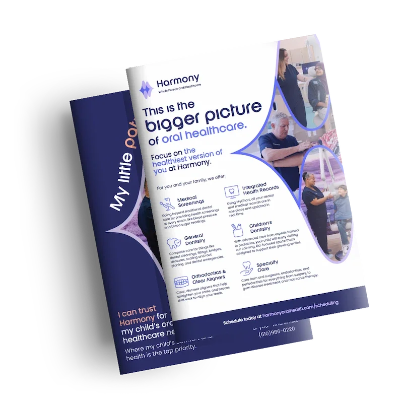
HEALTHCARE PRINT & DIGITAL ADVERTISING
Care for All of You
Print and digital copy for a dental clinic that thinks bigger than teeth.
Harmony is a whole-person oral healthcare practice in Oakland offering everything from pediatric dentistry to oral surgery, medical screenings, and integrated health records. I wrote copy across a suite of print materials: service flyers, community-facing pieces, and a pediatrics postcard. The copy had to make a complex, ambitious healthcare offering feel accessible, warm, and worth the drive downtown.
ROLE
Senior Copywriter
ORGANIZATION
Hedy & Hopp for Harmony
What’s the solve?
This brand positioning involves whole-person oral healthcare, medical screenings at every visit, augmented reality check-in experiences, and integrated health records. The copy had to do two things simultaneously: convey the breadth of what Harmony offers without overwhelming a prospective patient, while highlighting the high-tech healthcare experience. The pediatrics piece added a third layer, speaking directly to a parent's worries about bringing their little one to the dentist.
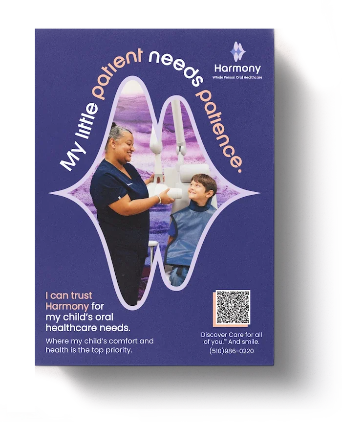
The Pediatrics Newspaper Ad
"My little patient needs patience" speaks directly to a parent's real anxiety about bringing a child to the dentist. A single headline that earns trust before asking for anything else from already busy parents.
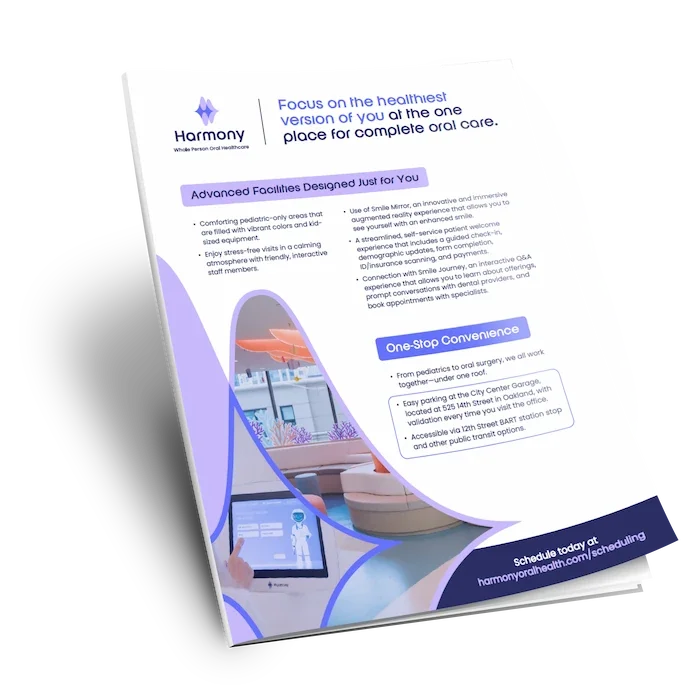
The Community Flyer
Convenience and facility-focused copy aimed at prospective patients, especially thsoe weighing whether Harmony is worth the trip. Parking, transit, the pediatric space, and the Smile Mirror experience all show practical information written to feel like an invitation (not a fact sheet).
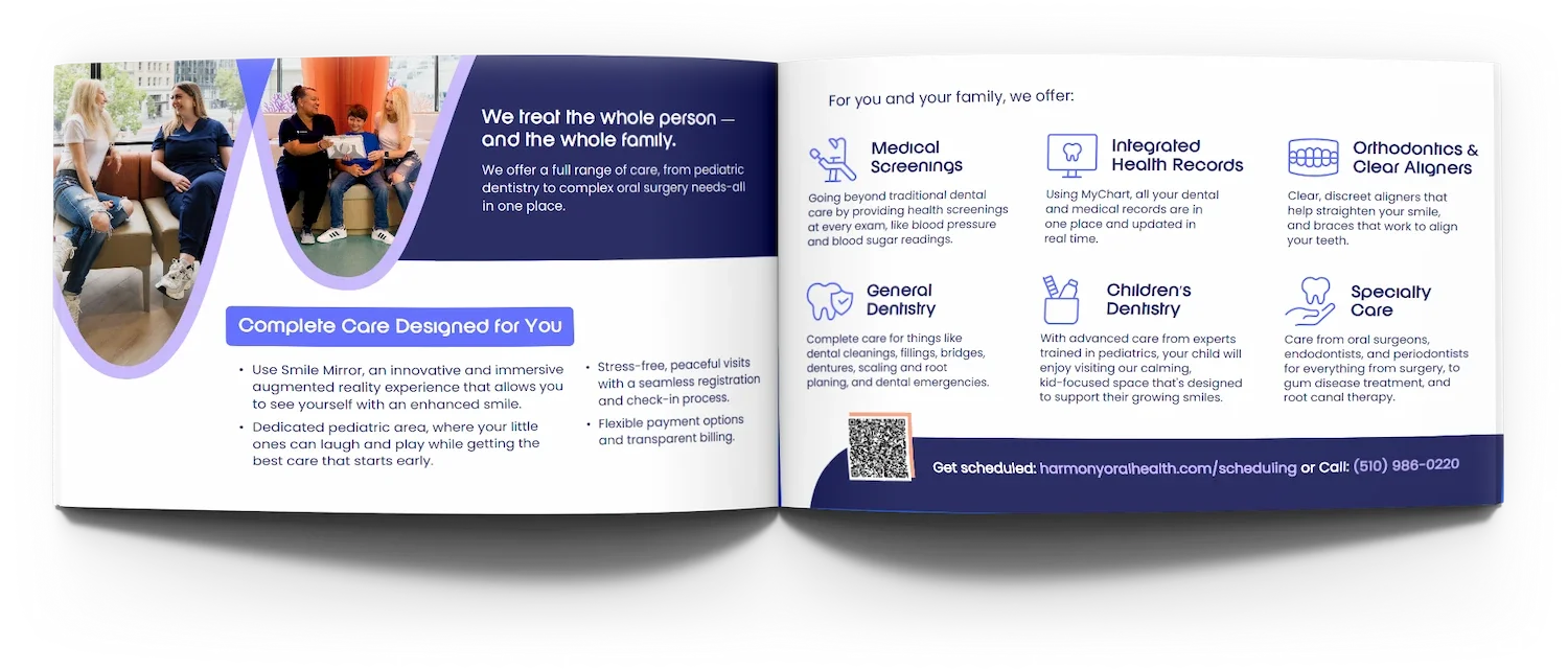
The Folded Booklet
A full overview of what Harmony offers, from general dentistry to specialty care, medical screenings, and integrated health records. Copy that makes a long list of services feel like a coherent vision rather than a menu.
What I brought to it.
Most dental marketing defaults to clean smiles and stock photo confidence. Harmony's proposition is genuinely different, and the copy had to reflect that without turning every piece into a capability deck. I approached this copy with the thought that each marketing piece needed to solve something.
The services flyer needed hierarchy and clarity to make a complex offering scannable, the community flyer needed to make logistics feel like hospitality, and the postcard needed a single idea that could stop a parent in their tracks and make them feel at ease.